-
Vigo Importing Co.
![]()
Reinvigorating Vigo
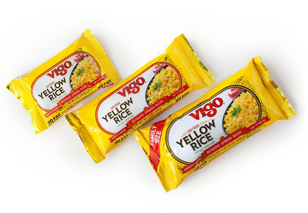
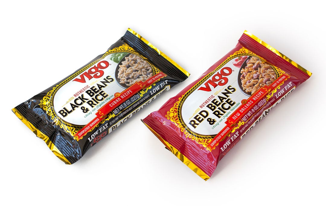
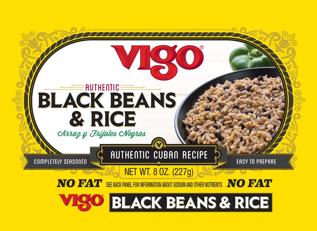
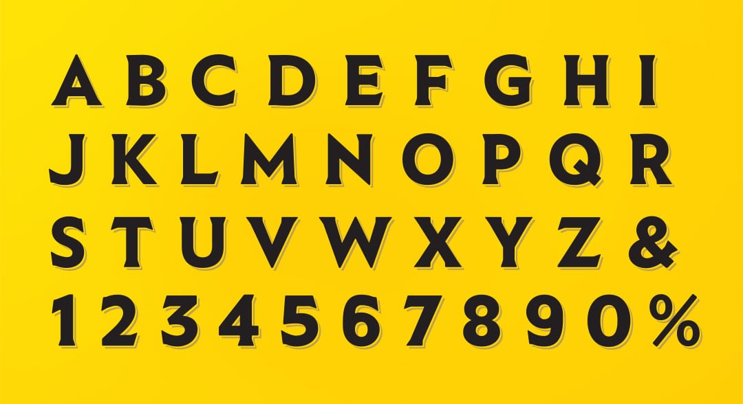
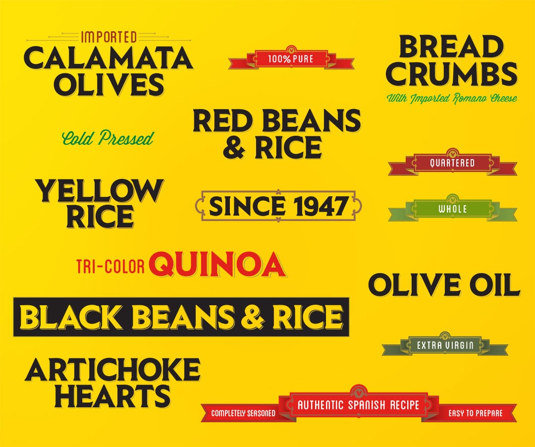
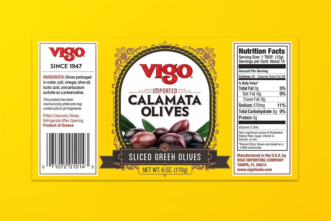
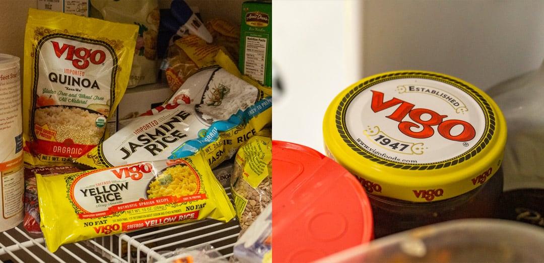
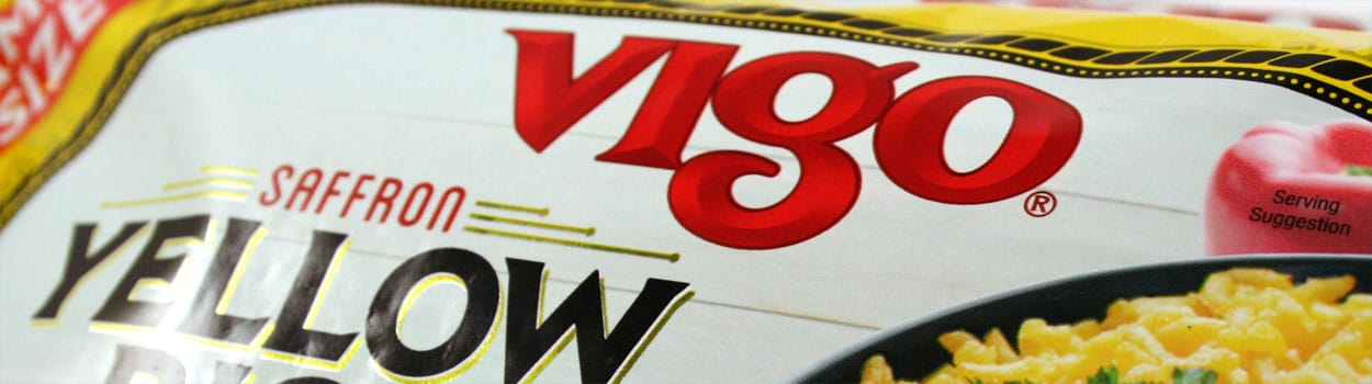
The problem that needed to be solved was how to unify 100s of products, with a modular design strategy, and retain the brand equity built by decades of quality. Another hurdle was getting the product on every label across the product line, and shot in a way that would be unique to the brand. A unique custom serif font was created for the brand that maintains a classical feel with modern geometric architecture.
The new design uses a system of color-coded flavor descriptors, gold foil patterns, and a versatile system of brand elements that commemorate the brand heritage. This was a huge endevor that will hopefully last another 50 years for Vigo Importing Co.